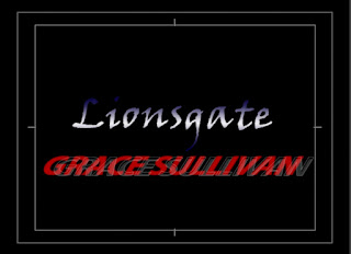
 We have decided that we will probably use red font colour to promote blood with a shadow of white which creates a mysterious atmosphere. At the moment this is just an idea as we are still researching around the different fonts that we can get. We know for definite that our actors will be in a smaller, more discrete font than the distributor, producer, director etc. We have an example of one of our actors fonts and colour choice.
Transitions:
 We have decided to practise using this adobe software so that we can prepare our title sequence and get used to the idea of using this program. The title transitions that we have liked so far are 'doors' which can be found under the section 3D motion. It would be ideal for us to use when the doors of the train are shutting, especially if we could synchronise them together. We also liked 'barn doors' which could be found under the section wipe. It would be really good to use when the doors are opening. The transition 'split' would also be good to use during the footage of the doors.
No comments:
Post a Comment